In many ways, the ticket is the perfect ballpark souvenir.
It doesn’t take up nearly as much space in the home as a cap or a T-shirt, nor does it possess the calories that come in a souvenir cup. It presents no additional expense to the fan, and it’s a simple object that can tell a story.
Since I began taking a serious approach to visiting ballparks in 2010, I’ve enjoyed keeping whatever tickets I get. I’ve got plans to eventually display them in my home office. For now, they’re safely tucked away in an envelope and a quick glance at any of them can take me back to a specific time, place and even a feeling.
As Opening Day of the 2020 season approaches, I thought it would be fun to share my collection with all of you in a two-part post. For me, it’s a blast to take a look back at these tickets. The diversity among designs makes each one unique, and I hope you enjoy browsing through the following images and notes as much as I enjoyed looking at them myself.
Starting way back in 2010, here’s my ticket collection:
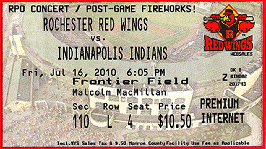
July 16, 2010: Indianapolis Indians at Rochester Red Wings
This might be the ticket that I cherish the most in my entire collection, as it’s from the very first game that I attended after deciding to start my website and blog. Seeing it immediately brings back a wonderful feeling of adventure — I easily recall the experience of making the 4.5-hour drive to Rochester, walking around the park before the gates opened and finally entering to watch the game. Frontier Field is one of my very favorite places to visit, and I know that the thrill of my first visit plays a role in this feeling. A few things of note about this ticket — it’s got my name on it because I bought it online in advance, and I love the aerial shot of the ballpark in the background.

July 17, 2010: State College Spikes at Auburn Doubledays
Measuring less than four inches in height, this is the smallest ticket in my collection. It’s one of only a few vertically printed tickets, too, which further makes it unique. This one is from Day #2 of my first baseball road trip, so it holds special memories. Falcon Park is an outstanding, no-frills place to watch a game at one of the lowest levels of the minor leagues, and this ticket design perfectly embodies that vibe.

July 18, 2010: Pawtucket Red Sox at Syracuse Chiefs
Here’s a ticket from the last game of my first road trip, so it’s a special one for that reason alone. There are some additional details that I like about this one, though. The 2010 season was the 50th anniversary of the franchise, so there’s a stylish logo in the background. I also like the historic graphics, including the MacArthur Stadium (the team’s home between 1934 and 1996) lettering. The Chiefs have since rebranded to the Mets, so it’s nice to have a ticket with the old name and logo.

August 6, 2010: Columbus Clippers at Buffalo Bisons
While there are some bland elements on this ticket — namely, the lack of logos — I kind of like the background. It’s a shot of fans at the Bisons’ ballpark (then known as Coca-Cola Field, now known as Sahlen Field) and it’s one of the only tickets I’ve seen with this type of look.

August 7, 2010: Minnesota Twins at Cleveland Indians
The scan of this ticket makes the background look washed out a little, but for a fairly generic overall design, it’s one that I like. As a lover of ballparks, I like that the Progressive Field wording is visible in the middle of the ticket. The right side of the ticket with the ballpark logo and stylized team’s website is really sharp looking, too.

August 8, 2010: Minnesota Twins at Cleveland Indians
This ticket is from my second day in Cleveland, and while the design is the same, there’s one thing of note. You’ll see on the ticket from August 7 that I spent $28 to sit in the bleachers. I spent so much of that first game walking around and taking in the sights that I wanted to spend less on my ticket for Day #2. The $10 price tag for this ticket is a lot more appealing.

August 9, 2010: Aberdeen IronBirds at Mahoning Valley Scrappers
After two days in Cleveland, I made the short drive to Niles, OH, to watch the Indians’ Short-Season A affiliate in action. You’ll see that this is a front row ticket, but I recall spending a lot of the game seated in the upper rows of the ballpark so that I could be in the shade. I like the photo of the Scrappers celebrating a win in the background, and the idea of the team hosting Senior Day and Daycare Day on the same day is, well, unique.

August 10, 2010: Boston Red Sox at Toronto Blue Jays
As is often the case with things associated with Toronto, this is a fairly expensive ticket by 2010 standards. In fact, it’s still one of the priciest tickets in my collection. There are lots of design elements that I like on it, though. I was a big Adam Lind fan at the time, so getting a ticket with him in the background was a thrill. I’m also really partial to the baseball image with the bold stitches.

August 11, 2010: Boston Red Sox at Toronto Blue Jays
The next day, I got a ticket with Vernon Wells in the background. I like how the Jays changed up the background images so frequently back in 2010. It’s something simple, but really improves the look of the ticket. You’ll notice the price discrepancy between these two Rogers Centre tickets, too. Just as I’d done in Cleveland, I paid more for the first game, and then saved money with a cheap ticket for the follow-up visit.

September 10, 2010: Trenton Thunder at New Hampshire Fisher Cats
This is another of my personal favorites for a number of reasons. This visit goes down as one of my all-time best ballpark experiences, as there are fewer places that I’d rather see a game than the Fisher Cats ballpark. This was the first MiLB playoff game that I’d ever attended, and this ticket is cool because lots of the information has changed in the years since. Namely, the team rebranded its colors after the 2010 season, moving from yellow and green to red and blue. The ballpark’s name also changed from MerchantsAuto.com Stadium to Northeast Delta Dental Stadium.

September 11, 2010: Brooklyn Cyclones at Tri-City ValleyCats
I remember being very excited about attending this game. It, too, was a playoff game, and it was one that I hoped to attend after being in New Hampshire. For this game to even be scheduled, the ValleyCats needed to knock off their first round opponent, Batavia, on September 10. I remember checking MiLB.com in the business center of my hotel on the morning of September 11, seeing that the ValleyCats had won and were now hosting the Cyclones in the New York-Penn League championship, and driving straight to Troy, NY, for that game. Very exciting for a new baseball traveler. This is a ticket design that appeals to me because of the image of the ballpark in the background, but I wish the usher hadn’t torn off the right side.

May 19, 2011: Tampa Bay Rays at Toronto Blue Jays
The 2010 season whet my appetite for baseball road trips, but the 2011 season marked the year that I really spent a lot of time on the road. I ended up visit 24 ballparks in 2011, including several that I’d been eager to visit for years. My first game took place in the familiar environment of Rogers Centre, and you’ll see that I’ve got a few tickets from that experience. The first one is the one that I bought, and you’ll notice that its design looks far plainer than it did a season earlier. At some point during the game, I was stopped in the concourse by an elderly lady and her grandchild. She was taking the child home, and offered me her 100-Level tickets for the remainder of the game. You’ll notice that the look of this pair, featuring Travis Snider and Brandon Morrow is far more appealing than my ticket. That’s because they’re parts of a season ticket package, which always offer nicer ticket designs.


May 20, 2011: Houston Astros at Toronto Blue Jays
It’s back to the plain, ol’ ticket design for this one from my second game in Toronto. I also notice in hindsight that I spent more for this ticket than I did a day earlier, which has me puzzled. I believe I made this decision because I’d spent much of the first game exploring the stadium, and wanted to sit and enjoy the game more on the follow-up visit — and wanted to do so from a section that offers a good view of the field.

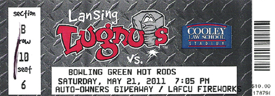
May 21, 2011: Bowling Green Hot Rods at Lansing Lugnuts
This is a ticket design that really stands out in my collection. I love how prominently the design features the team and ballpark logos, and the checker plate design makes this one really eye catching. You’ll notice a stroke of black ink on the left side — that’s instead of the usher ripping off the side of the ticket when I entered the park.
May 22, 2011: South Bend Silver Hawks at Great Lakes Loons
It might sound a little silly, but looking at this ticket design gives me a sense of calm. The nature scene in the background evokes what I saw when visiting Midland, MI — lots of trees and clean-smelling air. Kudos for the Loons’ design team in 2011 for coming up with this original design.

May 23, 2011: Fort Wayne TinCaps at West Michigan Whitecaps
A ticket from my first Caps vs. Caps match-up, there’s a lot going on here. The design feels text heavy, especially after the simplicity of the Loons ticket above. That said, I like the ballpark logo in the upper right corner and the team logo below it. There’s an action photo in the background, but it’s difficult to see very well.

May 24, 2011: Tampa Bay Rays at Detroit Tigers
The first ticket is one of the dullest tickets from my collection. It’s another one that I bought in advance online, and it features the Tickets.com logo in three separate locations but doesn’t include a Tigers or Comerica Park logo anywhere. I temporarily misplaced this ticket when I got to Detroit — perhaps subconsciously as a silent protest to its dull design — so I had to visit the Comerica Park ticket office to get a reprint before I entered the ballpark. The replacement ticket is far more appealing because of the nice ballpark image in the background, but the use of green — which has nothing to do with the Tigers — detracts to some degree.


May 25, 2011: Tampa Bay Rays at Detroit Tigers
In advance of my second game in Detroit, I bought this ticket. It’s got a design that is almost the same as the reprinted ticket from May 24. The lone exception is the red border instead of the green.

May 26, 2011: Durham Bulls at Toledo Mud Hens
This ticket from Toledo is really appealing. Not only does it have the team and ballpark logos in various locations, but its use of pinstripes makes this design a unique one. I also like the “Experience the Joy of Mudville” wording across the top of the ticket.

May 27, 2011: Great Lakes Loons at Fort Wayne TinCaps
I drove through a crazy storm with flooded roads to get to Fort Wayne on this visit, so I remember being thankful to finally be holding this ticket in my hands. The action photo in the background works well, and I appreciate the Parkview Field logo in the upper right corner of the main part of the ticket.

May 28, 2011: West Michigan Whitecaps at Lake County Captains
Here’s a ticket with an unconventional shape. While the right side of the ticket is missing after being torn off as I entered the park, the upper section of this ticket gives it an odd shape. I’m fairly on the fence about this upper portion — the information isn’t of interest to me, but I kind of like how it makes the size and shape of the ticket unusual. The simple blue design with the team’s logo in the background works well on the main part of the ticket.

May 29, 2011: Reading Phillies at Erie SeaWolves
Even if it weren’t missing the rip-off section on the right side, this ticket is very dull. The SeaWolves uniforms at the time didn’t have any yellow, so the overwhelming yellow color of the ticket seems off. The background image is also difficult to identify.

June 23, 2011: Norfolk Tides at Scranton/Wilkes-Barre Yankees
This ticket might not look like much, but I actually like it. It’s difficult to see in the scan, but the back of the ticket says “Yankees” in silver lettering. I also like the PNC Field logo in the bottom left corner, although I wish it were bigger. Content wise, I think having the information about the gate opening time is a smart move.

June 24, 2011: Altoona Curve at Harrisburg Senators
Although small because of having the right side ripped off, this is a really stylish ticket. It depicts Stephen Strasburg in the background, as he played for Harrisburg for a short stint in 2010. You’ll also notice the logo commemorating 25 years of the franchise, which further makes this ticket a cool keepsake. If you caught the price and wondered why it was so high for an MiLB game in 2011, I sat in the All-You-Can-Eat section.

June 25, 2011: Staten Island Yankees at Aberdeen IronBirds
Affordable, simple and funny. That’s how I describe this ticket from the Aberdeen IronBirds. The affordable and simple traits speak for themselves, but you might wonder why this ticket is funny. The “Fashionably Late” wording represents the fact that I bought this ticket on the day of the game, rather than in advance.

June 26, 2011: Binghamton Mets at Bowie Baysox
I think this is a really eye-catching ticket, with a number of design elements that work well. I like the player images, the use of the MiLB logo and the Baltimore Orioles affiliate logo. One creative detail that you might not notice at first is the Louieville, MD, wording up top. The team’s mascot at the time was named Louie, so this wording is a tip of the cap to it. This design would be perfect if it were tinted in orange, rather than blue, to reflect the team’s branding.

June 27, 2011: Lakewood Blueclaws at Hagerstown Suns
This is the ticket from the game at which I saw Bryce Harper and got his autograph, so it’s a special one for me. The huge logo graphic works well in the background, especially given that the text in front of it is smaller and thinner than you’ll find on most tickets.

June 28, 2011: Greensboro Grasshoppers at Delmarva Shorebirds
This Shorebirds has a clean, simple design that really works. In person, the background logo has a slightly shiny appearance that doesn’t come through in the scan.

June 29, 2011: St. Louis Cardinals at Baltimore Orioles
Given that I’d admired Oriole Park at Camden Yards since it opened, I was pumped to finally be holding this ticket in my hands. While its design doesn’t exactly generate a whole lot of excitement, I appreciate the use of the B&O warehouse image in the background, given that this building is as part of the ballpark as perhaps any building in baseball.

June 30, 2011: St. Louis Cardinals at Baltimore Orioles
With the exception of the date and the seat information, this ticket is identical to the one from a day earlier. Side note: Seeing these two tickets reminds me that I need to get back to Baltimore. Stat.

July 1, 2011: Winston-Salem Dash at Potomac Nationals
This is another scenario in which the usher ripping the edge off the ticket really hinders its look. I’m glad this isn’t done anymore. Design wise, it’s hard not to like the look of this ticket. The P-Nats, as they’re known, won the Carolina League title a year earlier, so this picture of the championship squad really adds life to this ticket.

July 2, 2011: Pittsburgh Pirates at Washington Nationals
A day after seeing the P-Nats, I was in D.C. to see the real Nats. This is a ticket that I bought a few hours before the game, and it offers a pretty standard design. If I have to pick something that I like about it, I find that the “Washington Nationals | Nationals Park | Washington, D.C.” wording on the top of the ticket is unique and appealing.

July 3, 2011: Pittsburgh Pirates at Washington Nationals
Once again, we’ve got a virtually identical ticket during my second day in an MLB city. The only difference with this one is the price, which is pretty sweet at $5.

July 4, 2011: Portland Sea Dogs at Binghamton Mets
Bought before my first Independence Day baseball game, this ticket has an attractive design. The Mets are another team that has rebranded since this visit — they’re now the Rumble Ponies — so I’m glad to have this ticket in my collection. The 20-year franchise logo is a nice touch, albeit sort of hard to discern. This is another ticket in my collection that has my name printed on it. Somehow, the team managed to spell my last name wrong.

July 28, 2011: Reading Phillies at New Hampshire Fisher Cats
When I visit ballparks during back-to-back seasons, I enjoy taking note of the differences in the park. It’s also fun to assess the tickets from each season to see how they differ. You saw a 2010 Fisher Cats ticket near the top of this post, and here’s its counterpart from 2011. As you might notice, the color scheme is different to reflect the team’s rebranding, and the ballpark’s name has changed, too. The Fisher Cats hosted the Eastern League All-Star Game in 2011, so there are logos on the bottom of the design to reflect that event.

July 31, 2011: Altoona Curve at Portland Sea Dogs
While this ticket design looks a little dated for a reason that I can’t quite put my finger on, it’s still a sharp look. I love the background image of the team’s notable alumni. If you look carefully, you’ll see Red Sox notables such as David Ortiz, Jonathan Papelbon and Jon Lester represented.

August 21, 2011: Hudson Valley Renegades at Vermont Lake Monsters
On some tickets, the background image is so light that it’s difficult to read. This Lake Monsters ticket is the opposite. I find that the background is just a little too pronounced, making the text in the foreground more challenging to see than it should be.

September 23, 2011: Minnesota Twins at Cleveland Indians
Here’s a case of an MLB team not changing its ticket design from one season to another. If you look at this ticket versus those from Progressive Field in 2010, there’s virtually no difference.

Check out Part II of my collection here!
You must be logged in to post a comment.